Important Note
I was in charge of the visual elements so I will be focusing on those and only bringing up other elements when relevant.
About the Project
Post Plants was developed for the GDL August 2022 game jam. The game is an action farming sim based on the mandatory theme “Death is not the end… Death is progress”. We had to get the game to a playable state and upload it to itch.io within the 72 hour time limit. We decided to do a less edgy spin on the idea by theming it around gathering dead crops and using them to create compost which gets used to enhance future crops and increase earnings. We did not formally write a GDD, however, I did make a task list for myself to keep on track and budget time appropriately.
Pros
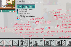
Creating a task list for myself was essential. It made it possible for me to group and plan assets, sort by priority, cut down on extra work, and avoid scope creep. I used this list to track the current status of each asset and get almost everything done before the jam ended.
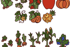
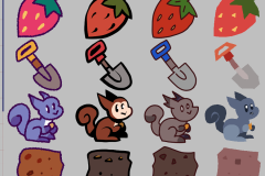
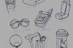
Drawing the static sprites went well because I set up my documents beforehand and organized their layers based on how I planned on drawing the assets. I used a graph paper style grid to make checking alignment and size easier, that way I could focus on getting things done instead of needing to come back later and try resizing things. I also organized items by like, making it easier to keep colors and appearances consistent.
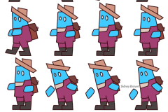
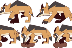
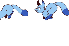
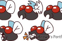
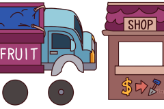
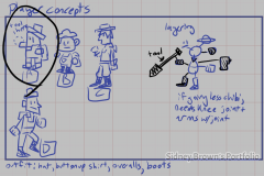
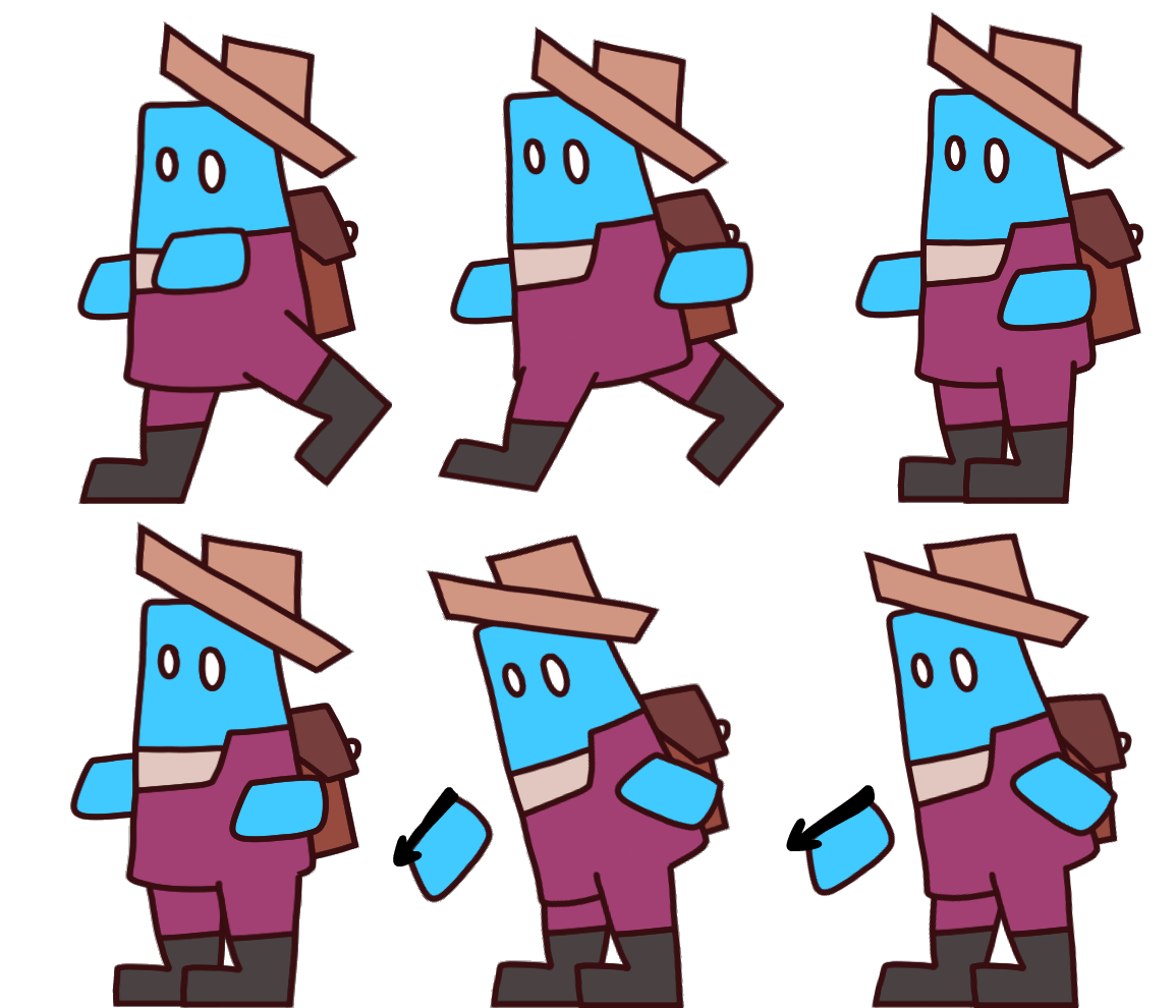
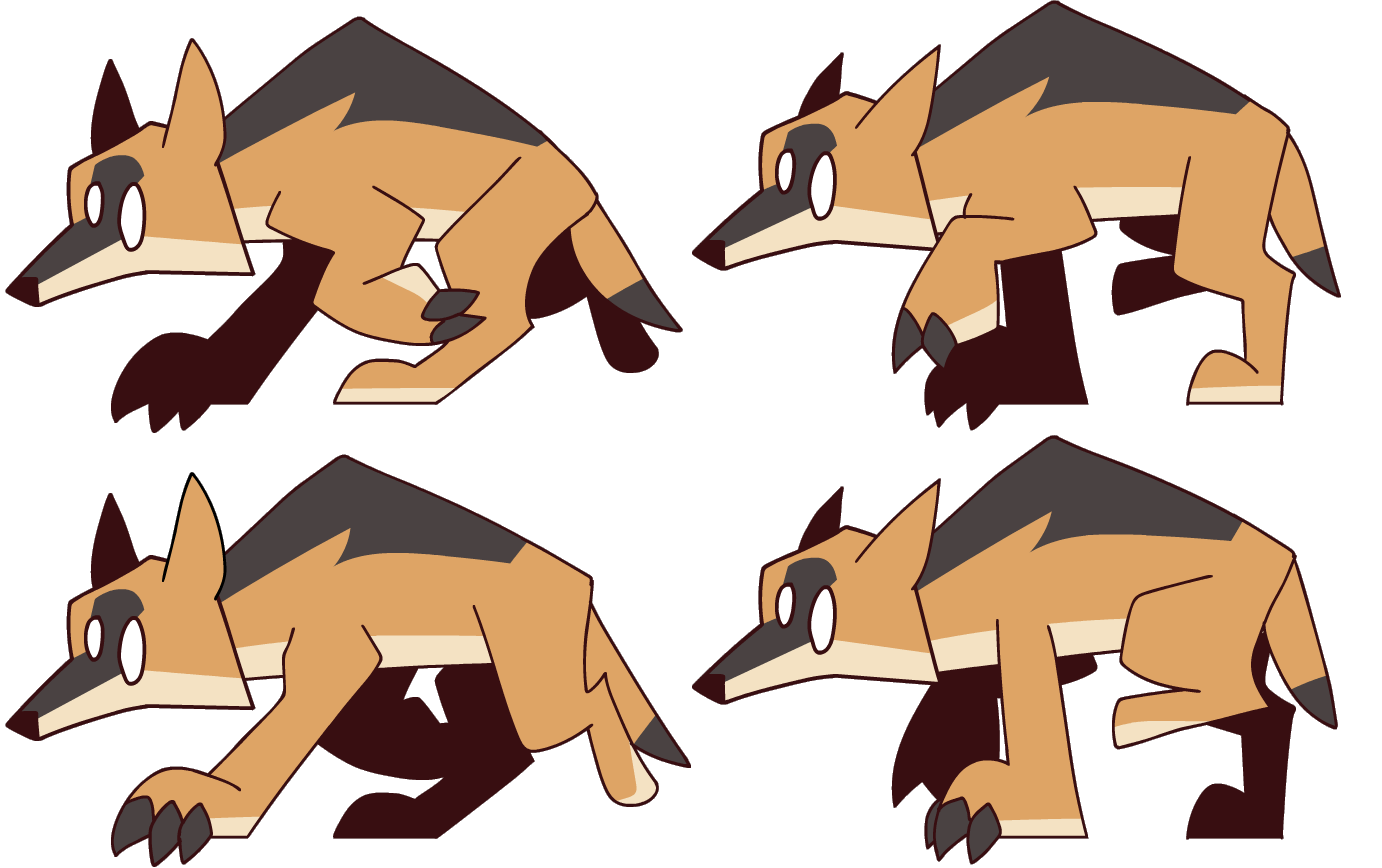
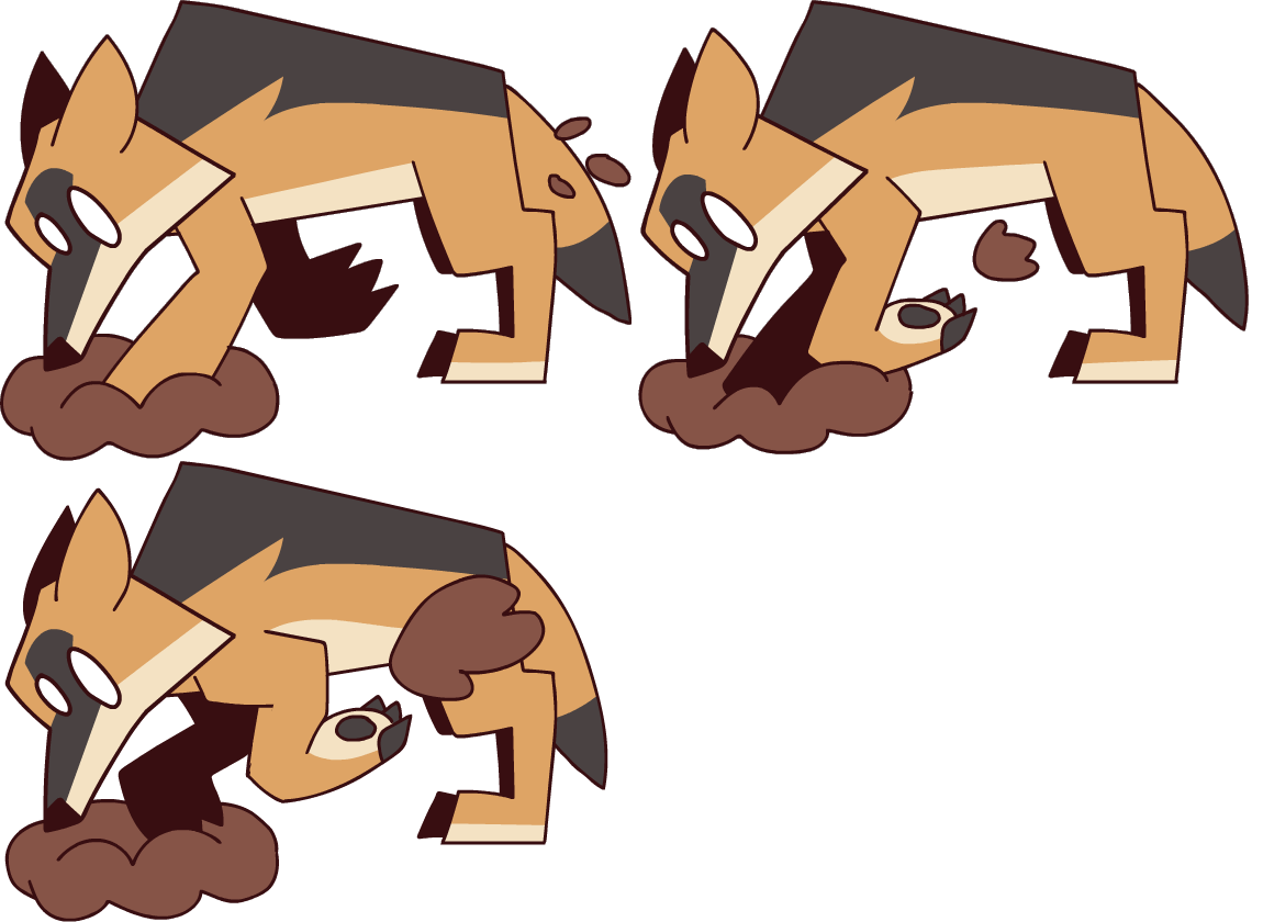
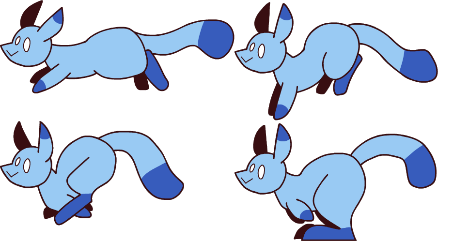
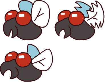
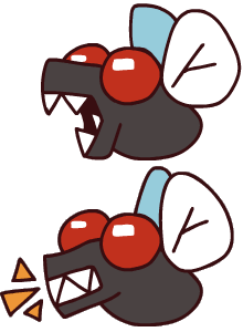
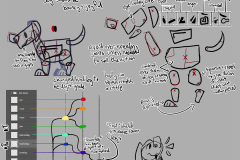
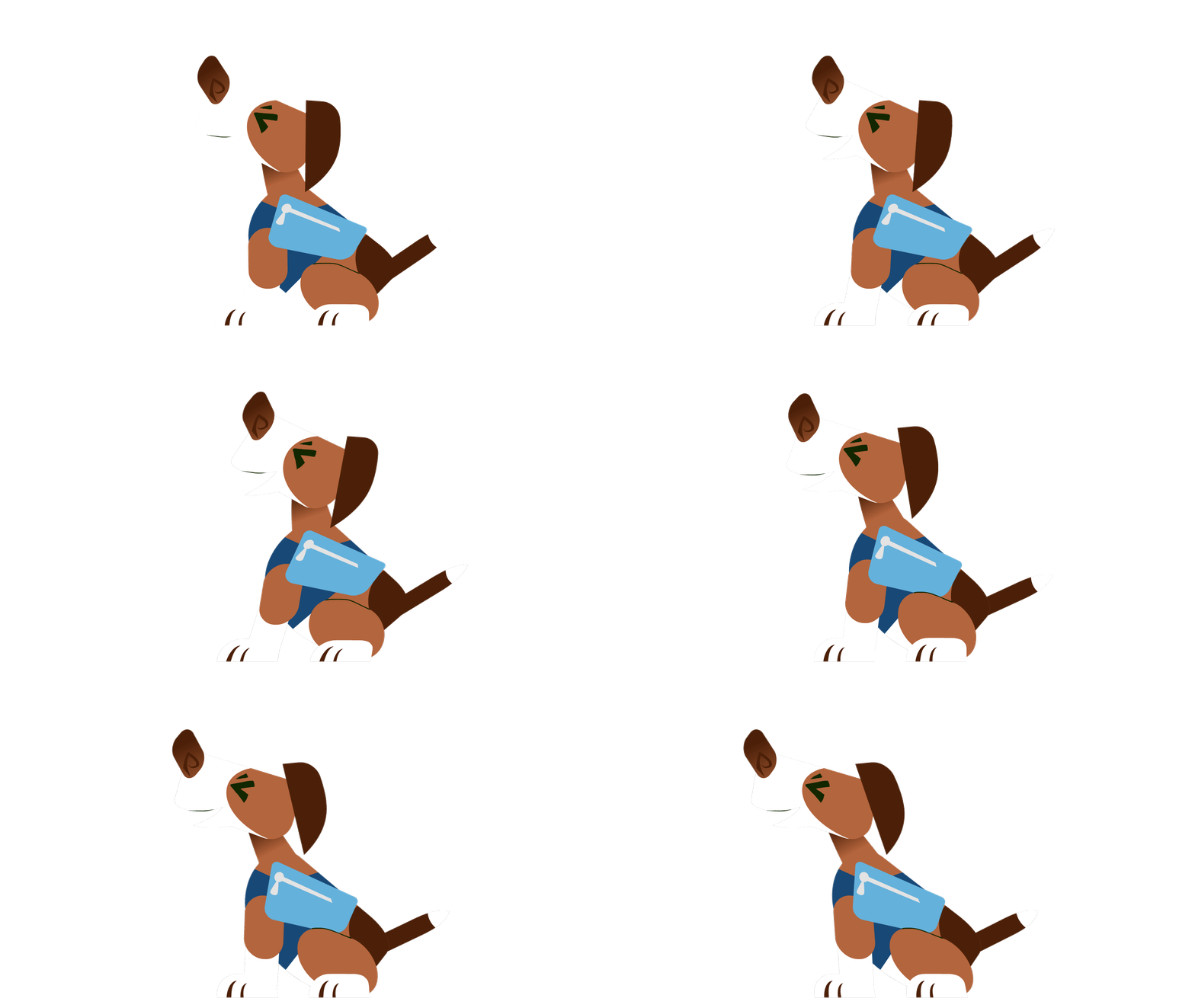
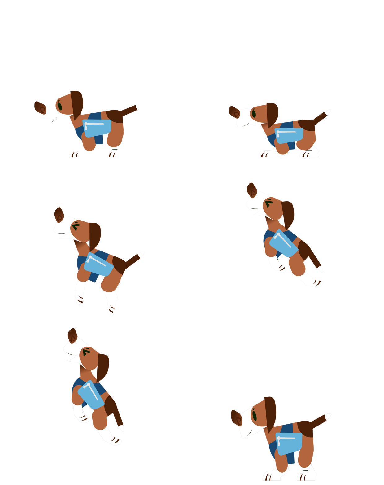
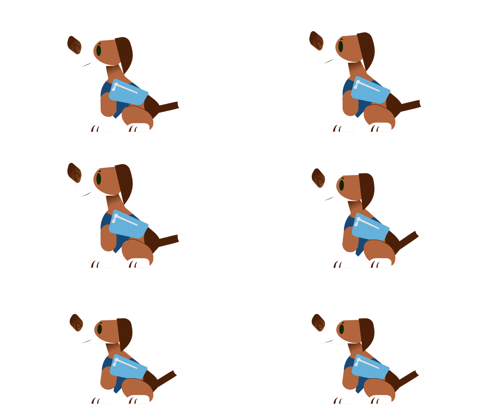
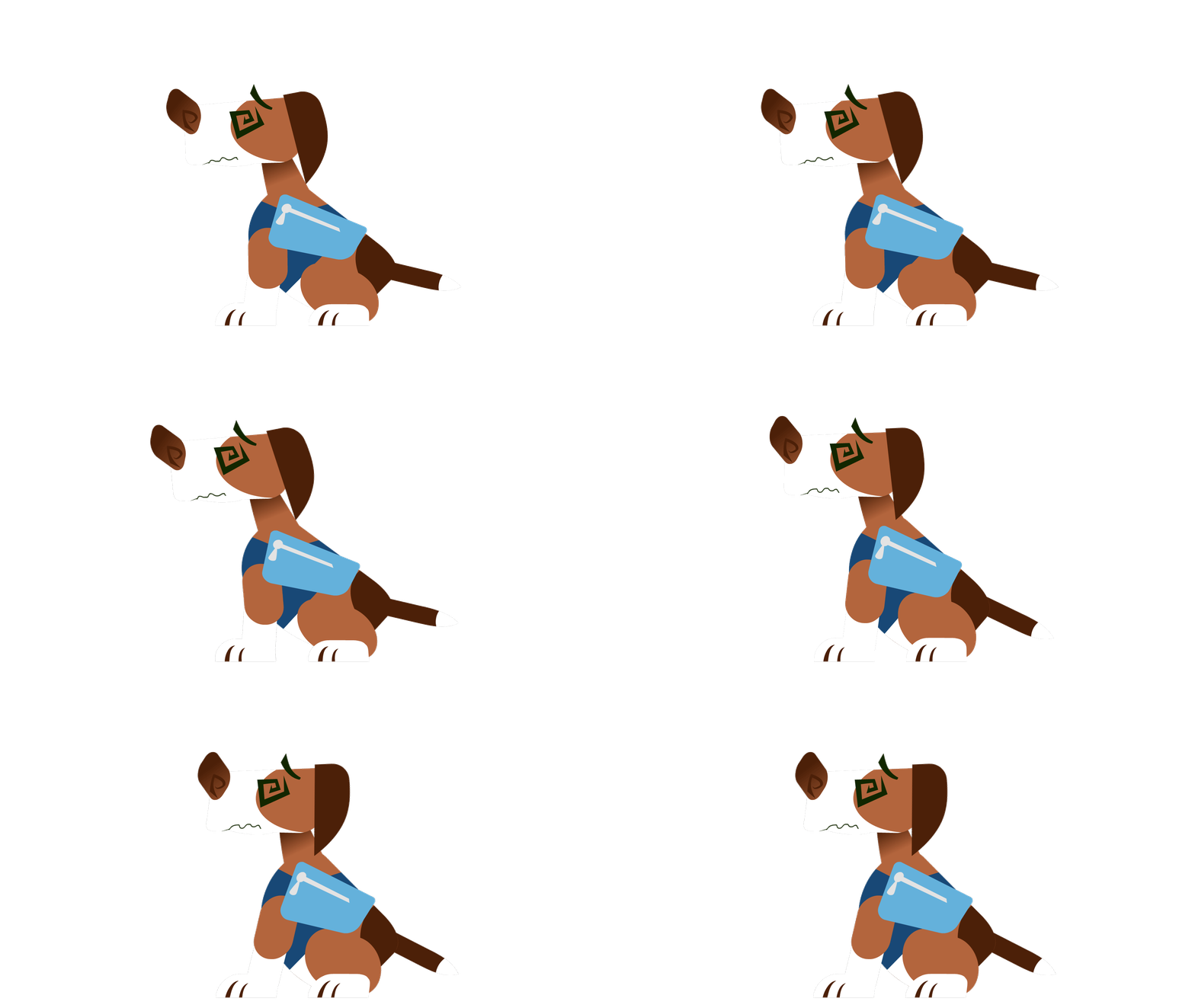
The animation process also went well since I went with a snappy and economical style for time reasons, and used software I’m very familiar with. The biggest hitch animation wise was the player’s animations, the player character was planned to have more actions than any of the foes so it was animated with a simple puppet instead of being frame by frame. For a short project like this, I’ve found that limited frame by frame looks better than limited simple puppets. If this were a long term project, a puppet would be more sustainable. One of the programmers, Imated, animated the truck and the shopkeeper while I was working on the other assets.
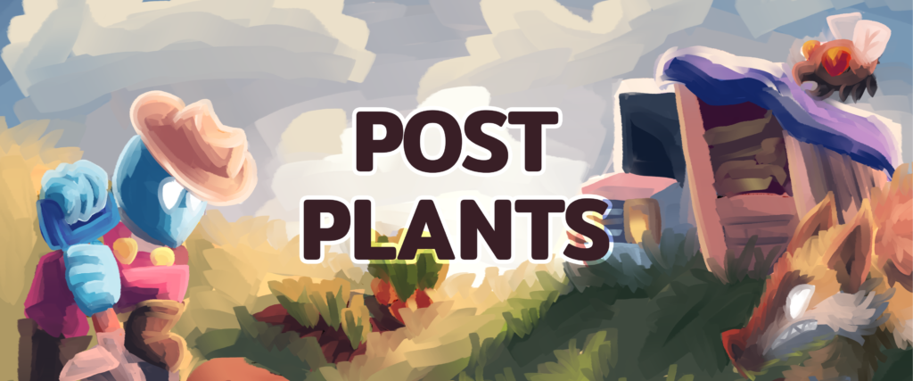
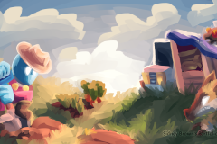
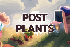
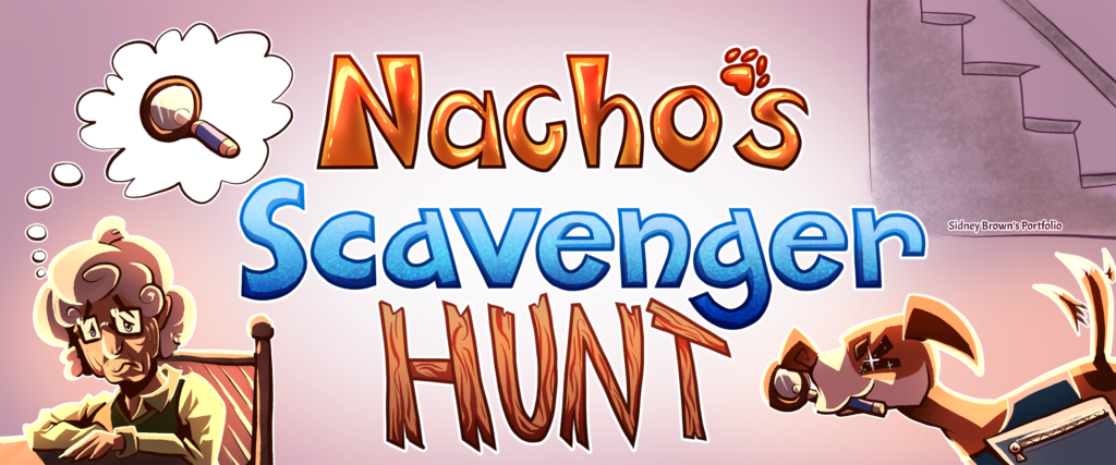
Creating the image used on the title screen, banner, and cover image went smoothly. This was because I set a very hard time limit and decided to stop after things were rendered just enough to make sense, since past that stage it’s refined rendering and tweaking which I evaluated as not worth it for the short time limit. I had also done some fully rendered paintings recently using that brush, so I was familiar with its uses and limitations. The brush used had blending on and saved me tons of time where I would’ve otherwise been constantly pausing to eyedropper and blend.
Cons
There was a power outage in the middle of the jam. On Aug 6th around 4:30 pm, I had a neighborhood-wide blackout that lasted for 2 hours. When the power came back, I had just enough time to inform my team about the delay and start preparing to do more work before the power went out for another 2 hours, each outage costing me a large chunk of prime development time. I was able to make up for this loss by working through the night but was less efficient than normal due to this.
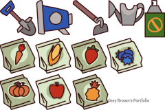
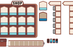
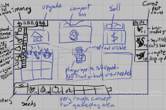
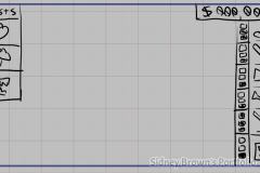
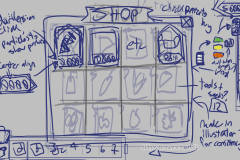
I had an extremely hard time creating the UI graphics and ended up spending hours discussing and working on the UI elements with my team. I think my issue was trying to make everything “perfect” and as clean as possible instead of being able to say it’s good enough. This tends to happen whenever I use Illustrator due to it being vector based and making it easy to get lost in the weeds.
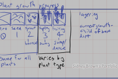
The plant images were implemented wrong due to communication issues. Their stems (part that meets the dirt) spanned several garden beds when implemented, but their stems were intended to only sit in one bed per whole sprite. I didn’t have time to reassemble the sprites into an easy to slice sheet due to time loss and wasn’t able to provide how much transparent buffer each plant should have, so the programmers just implemented the plants how they saw fit.
Risk Taking
Instead of working on each line of plants in smaller batches of 3, I worked on all of them at once. This could have resulted in no plants being implemented if things went wrong, however they were all completed in time since this made completing them faster for me. This also made them more consistent than they would’ve been, since pasting and manipulating relevant pieces is easier in the same document.
Being in charge of nearly every visual element, including UI and effects, was a huge risk. Due to UI and effects not being my area of expertise, I was very unlikely to create something as user friendly or satisfying as an artist focused on either of those disciplines could. The UI ended up being usable but rigid in look and feel relative to other assets, which was a decent outcome. On the other hand, the effects (particles, feedback, special effects, etc) were nonexistent since I didn’t prioritize them like the UI and didn’t really know where to go with them. This caused the game to be harder to follow and less satisfying.
Unplanned Changes
The player character was intended to have more animations- one for each tool being used and one for each possible state of the shovel (empty/dead plant/compost). This was cut for time and not being 100% necessary for functionality. I don’t think this cut negatively affected the game since the player character does carry the current tool.
Visible timers for the plants growing, being destroyed, compost cooking, etc needed to be cut for time reasons. I had intended for them to let the player see growth progress at a glance instead of guessing or trying to track it, but I couldn’t finish the assets for these due to prioritizing a working game first.
I had started planning a pause menu UI, but dropped it when it was clear one wasn’t going to be implemented for time reasons.
All particles and effects were dropped to save time. This caused the game to look unpolished and feel less satisfying than it could be, but it also resulted in the game being uploaded in time.
The compost cooking idle animation (steam rising up and off the pile) was dropped due to not being 100% necessary for functionality, same with animation of the sales truck driving off after the player sells things to it and then returning later.
For Next Time
During this process, I was reminded that pruning your plans to be more manageable should be done early so you can reallocate that time into working on other assets as needed, instead of just sinking that time with no return. I also learned that communicating about art to non artists who are not familiar with artist jargon requires patience and using more generalized terms to avoid confusion. In the past I had only worked with programmers who were decently familiar with the terms artists use. I also learned that UI and effects require a graphic designer’s knowledge to execute properly and I will need to practice creating these.
For future collaborative projects, I plan on making these changes so the process will be smoother. This should result in fewer misunderstandings, reduce time waste, and keep the project scope manageable with a set time frame.

